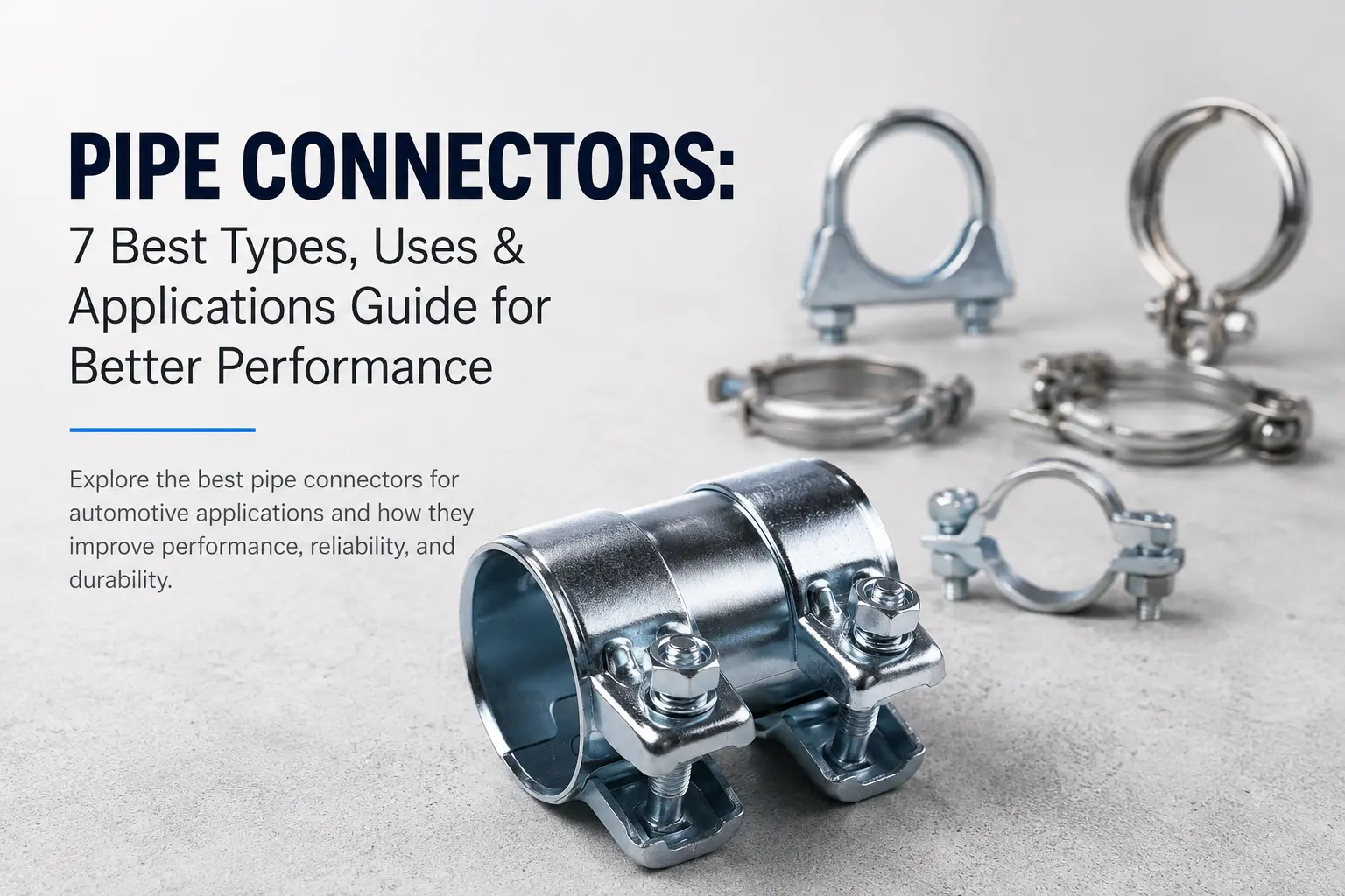
V Band Clamps vs Exhaust Clamps is a common comparison when selecting the right solution for automotive and industrial exhaust systems. Choosing the correct clamp is essential for durability, sealing performance, and long-term efficiency.
Both clamp types are widely used, but they differ significantly in design, strength, and application. Understanding these differences will help you choose the most suitable option for your requirements.
What Are Exhaust Clamps?
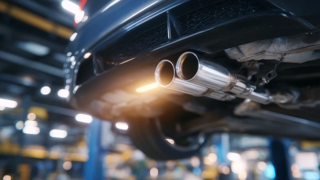
Exhaust clamps are traditional fastening components used to connect and secure exhaust pipes. They are commonly used in standard automotive systems due to their affordability and ease of installation.
These clamps are available in different types such as U-bolt clamps and band clamps. They are ideal for general-purpose applications where high pressure or precision sealing is not critical.
For reliable solutions, you can explore our range of exhaust clamps designed for automotive and industrial use.
What Are V Band Clamps?
V band clamps are high-performance fastening solutions designed to provide a tight and leak-proof seal between exhaust components. Their V-shaped design ensures uniform pressure distribution, making them highly efficient in demanding environments.
They are widely used in turbochargers, racing vehicles, and industrial systems where durability and precision are essential. You can explore our V band clamps for applications requiring strong and secure connections.
V Band Clamps vs Exhaust Clamps: Key Differences
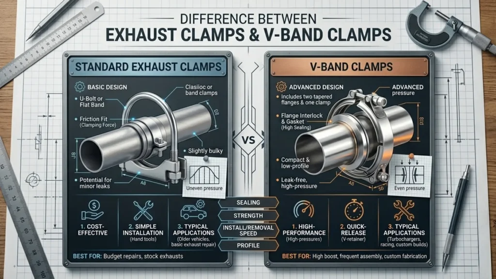
While both clamps serve similar purposes, their performance and usability vary significantly. The comparison below highlights the key differences:
| Feature | V Band Clamps | Exhaust Clamps |
|---|---|---|
| Design | Uses a V-shaped clamp with flanges | Uses U-bolt, band, or saddle design |
| Sealing Performance | Provides a tight, leak-proof seal | May allow minor leaks over time |
| Strength & Durability | High strength, suitable for demanding conditions | Moderate strength for standard use |
| Installation | Quick and easy to install/remove | Requires tools and more time to install |
| Reusability | Highly reusable without loss of performance | Limited reuse; may deform after use |
| Application | High-performance and industrial systems | Standard automotive exhaust systems |
| Pressure Handling | Suitable for high-pressure environments | Best for low to medium pressure |
| Cost | Higher initial cost | More economical |
This comparison clearly shows that V band clamps are ideal for high-performance applications, while exhaust clamps are better suited for standard and cost-effective use.
Advantages of V Band Clamps
V band clamps offer several benefits, especially in high-performance environments. They provide a secure and uniform seal, reducing the risk of leakage. Their quick-release design makes installation and removal easier, which is particularly useful in systems that require frequent maintenance.
Additionally, these clamps are highly durable and reusable, making them a preferred choice for industrial and automotive applications where reliability is critical.
Advantages of Exhaust Clamps
Exhaust clamps are widely used due to their simplicity and affordability. They are easy to install and readily available, making them ideal for standard exhaust systems and repair work.
For applications where high pressure and precision are not required, exhaust clamps provide a practical and cost-effective solution without compromising basic performance.
Which One Should You Choose?
Choosing between the two depends on your application.
If you need a high-performance, leak-proof solution for turbocharged or industrial systems, V band clamps are the better option. They ensure strong sealing and long-term durability.
On the other hand, if your requirement is for a standard exhaust system and budget is a key factor, exhaust clamps are a reliable and economical choice.
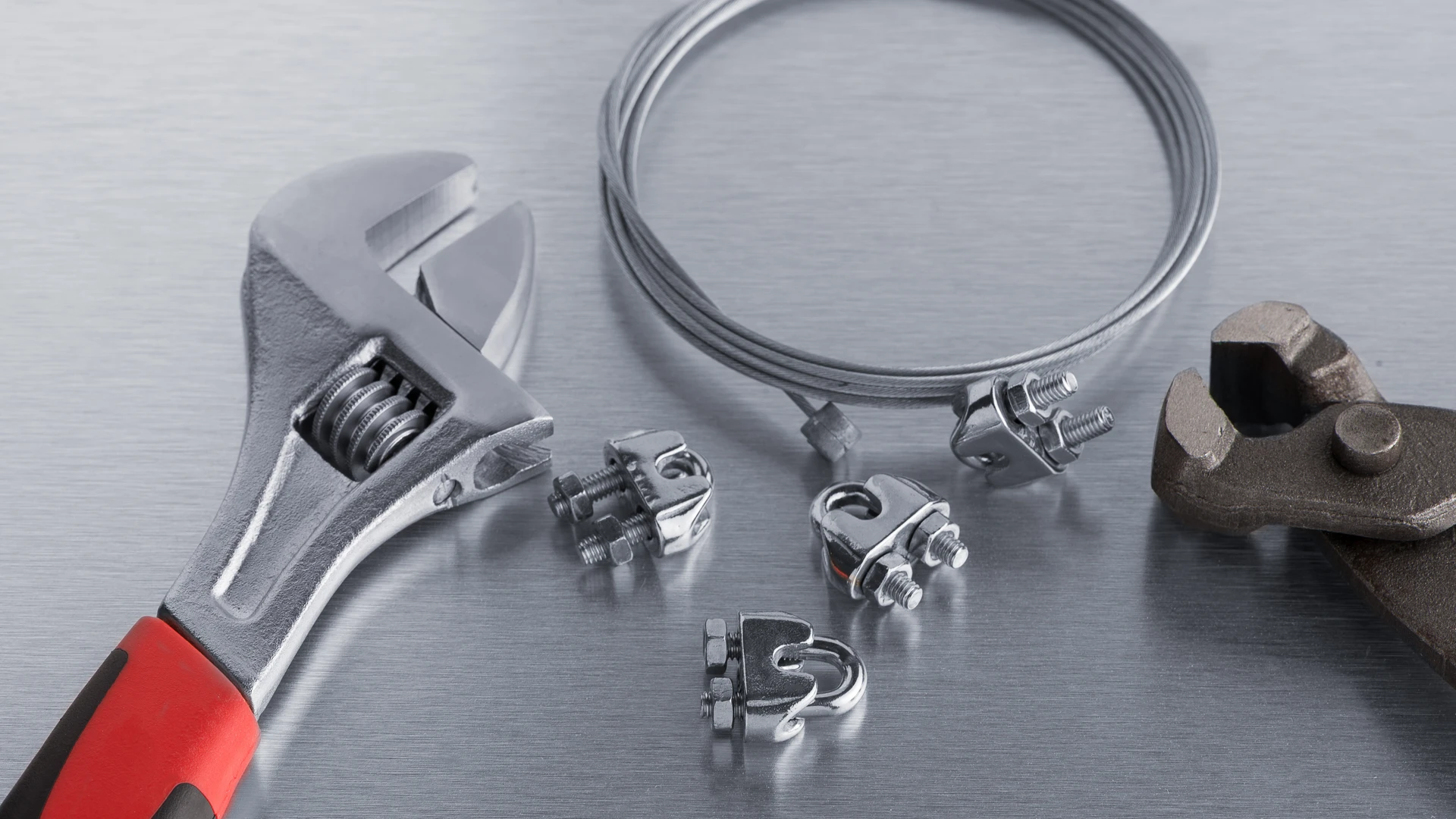
Material Considerations
Material selection plays an important role in clamp performance. Stainless steel clamps are highly resistant to corrosion and are ideal for long-term use in harsh environments. They offer better durability and require less maintenance.
Mild steel clamps, while more affordable, are suitable for less demanding applications and may not last as long under extreme conditions.
Applications in Automotive and Industrial Systems
Both V band clamps and exhaust clamps are widely used across automotive and industrial sectors. They are essential components in exhaust systems, piping setups, and heavy machinery.
According to industry standards, proper clamping ensures leak-proof connections and improves overall system efficiency.
Conclusion
V Band Clamps vs Exhaust Clamps ultimately comes down to performance requirements and budget. V band clamps are the preferred choice for high-performance and precision applications, while exhaust clamps offer a simple and cost-effective solution for standard use.
Selecting the right clamp not only improves efficiency but also enhances the reliability and lifespan of your exhaust system.
FAQs
What is the difference between V band clamps and exhaust clamps?
V band clamps provide a tight, leak-proof seal, while exhaust clamps are more affordable and suitable for standard applications.
Which clamp is better for exhaust systems?
For high-performance systems, V band clamps are better. For regular use, exhaust clamps are sufficient.
Are stainless steel exhaust clamps better?
Yes, stainless steel exhaust clamps offer better corrosion resistance and durability.